
Designing a companion app that keeps families informed during medical emergencies
As one of three designers, I helped design an iOS companion app that keeps family caregivers informed during emergencies and everyday care, increasing confidence in Bay Alarm Medical's service.

Role
Product Designer (UX Research & Interaction Design)
Team
3 Product Designers
Timeline
2 Weeks
Responsibilities
Research • Information Architecture • Wireframing • Prototyping • Usability Testing
Solution Prototype
INTRO
Families lacked real-time visibility into a senior's health during emergencies.
Bay Alarm Medical provides emergency response devices that connect seniors to trained operators and emergency services when help is needed.
The Challenge: While emergency operators could contact first responders, family members often had little visibility into what was happening or how their loved one was doing. This lack of timely information created anxiety, uncertainty, and delayed coordination among caregivers.
The Solution: We designed an iOS companion app that keeps family caregivers informed through real-time alerts, shared communication, and health information, extending Bay Alarm Medical's service beyond emergency response into everyday peace of mind
The Outcome: A prototype validated through user research and usability testing that addressed the biggest communication gaps identified by caregivers and seniors.
PRODUCT GOALS
How might we help family caregivers feel informed, reassured, and connected throughout a senior's care journey?
Based on our research, we defined three product goals that guided every design decision throughout the project.

Real-Time Awareness
Provide family caregivers with timely, real-time visibility into the senior's health and emergency status.

Caregiver Coordination
Enable seamless communication and coordination among caregivers during everyday care and emergencies.

Shared Health Context
Centralize important health information, appointments, and medical history so caregivers can act quickly when needed.
KEY RESEARCH INSIGHT
Families often don't know what's happening until long after emergency care has already begun, leaving caregivers feeling anxious, disconnected, and unable to help when it matters most.
Research
To understand the needs of seniors, caregivers, and emergency responders, we interviewed an EMT, a professional caregiver, and an at-risk senior. We then surveyed 23 seniors to validate our findings before defining the product direction.
-
Emergency responders often lacked immediate access to a patient's medical history, slowing care during critical moments.
-
Family members often learned about emergencies too late, leaving them feeling anxious and unable to support their loved one in real time.
-
Quick access to medical history could help responders make faster, more informed decisions.
To validate these findings at a broader scale, we surveyed 23 seniors. Two insights significantly influenced our design decisions:
-
86% of seniors’ care group are family members.
-
82% of seniors have one person only in their care group.
Design Decision:
Because most seniors relied on just one or two close family members, we focused the experience on supporting a small care circle rather than building a broader social network. This allowed us to deliver meaningful value while fitting naturally into Bay Alarm Medical's existing service model.


WHO WE DESIGNED FOR
Research showed that caregivers had different needs depending on how close they lived to the senior. Rather than designing a one-size-fits-all experience, we prioritized two primary caregiver roles.
Primary Caregiver
Family members who live farther away need reassurance without being physically present. They rely on real-time alerts, location updates, and care group communication to stay informed and respond quickly during emergencies.
Supporting Caregivers
Family members who live nearby play a more active role in day-to-day care. They need quick access to appointments, medications, and health information so they can coordinate in-person support.


MAPPING THE CARE JOURNEY
To better understand where communication broke down, we mapped the end-to-end experience of a caregiver before, during, and after an emergency. This helped us identify moments of uncertainty and prioritize opportunities where the app could provide the greatest value.
Key Findings:
The journey revealed that every major pain point stemmed from the same root problem. Caregivers lacked timely information about the senior's condition. This became the guiding principle for every feature we designed.

Biggest Opportunity: Families had little visibility during emergencies.
Biggest Frustration: Communication happened too late.
Design Direction Surface critical information as early as possible.
This exercise helped shift our focus from designing isolated features to designing a connected caregiving experience.
Prioritizing the MVP
Research uncovered many opportunities, but not every feature would deliver equal value. To maximize impact within the project's scope, I prioritized features using a Value vs Cost framework, focusing on solutions that addressed the biggest user pain points while remaining feasible to implement.
Rather than designing every possible feature, we focused on delivering the smallest set of features that solved the most critical communication problems for caregivers.

The prioritization exercise identified three capabilities that would deliver the greatest value to caregivers:
-
Real-time emergency awareness through live alerts and status updates.
-
Caregiver coordination through shared communication.
-
Shared health context through centralized medical information and appointments.
Tradeoff
Several ideas, including video calling and broader social features, were intentionally deferred. While valuable, they addressed less frequent needs and required greater implementation effort. We instead focused on strengthening the core emergency experience before expanding into additional capabilities.
EXPLORING THE SOLUTION
Translating research into early concepts
With the product goals and priorities established, I explored multiple layout and interaction concepts to determine how caregivers could access critical information with the least amount of effort. Early wireframes helped validate navigation, information hierarchy, and feature placement before investing in high-fidelity designs.
The home screen received the most exploration because it needed to balance emergency updates, health information, and everyday caregiving tasks without overwhelming users. I evaluated multiple layouts before identifying the information hierarchy that best supported quick decision-making.
How quickly can caregivers recognize an emergency?
What information should always remain visible?
How can everyday caregiving tasks coexist with urgent alerts?

These explorations allowed us to quickly compare different navigation patterns and information hierarchies before validating the strongest direction through usability testing.
VALIDATING THE EXPERIENCE
To validate our design decisions, I conducted usability testing with seven participants representing our target users. The sessions focused on whether caregivers could quickly understand the senior's status, navigate critical information, and respond appropriately during both emergency and everyday scenarios.
What We Validated:
✔ Caregivers could quickly understand the senior's current status.
✔ Participants easily located important information such as Medical ID and appointments.
✔ Users understood how the experience changed between emergency and non-emergency situations.
Testing also uncovered two usability issues that informed the final design:


These changes improved the visibility of critical information while reducing the effort required to navigate the app during stressful situations.
FINAL SOLUTION
The final experience was designed around three guiding principles established through research: keeping caregivers informed in real time, making health information easy to access, and simplifying coordination during both everyday care and emergencies.

Simple onboarding for existing subscribers
We designed a familiar sign-in experience that allows existing Bay Alarm Medical subscribers to quickly access the companion app using their preferred authentication method.
Real-time awareness
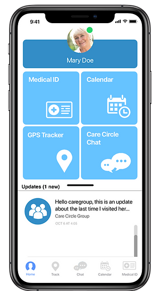
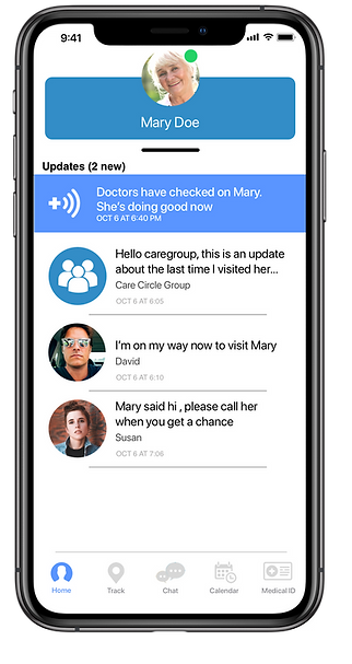
The Home screen surfaces the senior's current status, emergency updates, and device activity at a glance, giving caregivers immediate reassurance without requiring them to navigate through multiple screens.

Location during critical moments
Location sharing helps caregivers quickly understand where the senior is during emergencies, reducing uncertainty and making it easier to coordinate support.
Together, these features provide caregivers with continuous visibility into the senior's well-being, reducing uncertainty before, during, and after emergencies.
Caregiver coordination
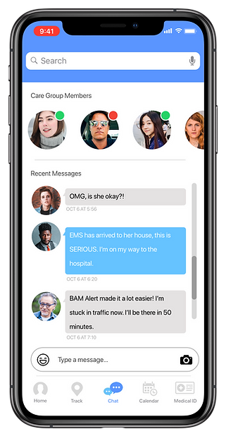
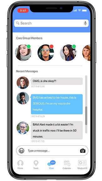
Shared messaging keeps caregivers aligned, making it easier to coordinate responsibilities without relying on separate communication tools.

Shared care schedule
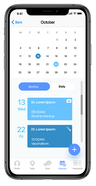
Appointments and medication reminders help caregivers coordinate ongoing care and reduce the likelihood of missed treatments.
Instant access to critical medical information
Medical ID centralizes allergies, medications, and health history so caregivers and emergency responders can quickly access important information when every second matters.


Persistent emergency updates
Emergency alerts remain pinned and continuously update until the situation is resolved, ensuring caregivers always know the current status without searching through the interface.
Clear resolution and peace of mind
Caregivers receive immediate confirmation when an emergency has been resolved, reducing anxiety and providing reassurance that their loved one is safe.
These features support collaborative caregiving by making communication and health information easy to share across the care circle.
OUTCOME
The final prototype successfully addressed the primary communication challenges identified during research and was positively received by participants during validation.
Participants consistently valued having immediate visibility into the senior's status, easy access to medical information, and a centralized way to coordinate with other caregivers.
One participant summarized the impact best:
“I wish I had the app last year. It would have been of great help to my family. We would have used it last year with my grandad.”
— Amanda (a potential service user)
NEXT STEPS
Measuring Success:
Although this concept was not shipped, we identified the key metrics that would determine whether the experience successfully improved caregiver communication and emergency response.
Product Metrics:
-
Caregiver engagement during emergency events
-
Time to acknowledge emergency notifications
-
Care Circle response rate
-
Medical ID access during emergencies
-
Task completion rate for key caregiver actions
Future Opportunities:
Research also uncovered opportunities that extended beyond the scope of the MVP. If the product continued to evolve, these are the areas I would explore next.
Motion Sensors
Opportunity:
Caregivers wanted greater visibility into the senior's daily well-being between emergency events.
Future Exploration:
Integrate home motion sensors to provide passive activity updates and notify caregivers when unusual patterns are detected.
Group Video Calls
Opportunity:
Families wanted more meaningful ways to stay connected beyond emergency situations.
Future Exploration:
Introduce group video calling to strengthen emotional connection and encourage more frequent interaction with seniors.
iPad Version
Opportunity:
The current experience primarily supported caregivers, leaving seniors with limited participation.
Future Exploration:
Design an iPad experience that enables seniors to participate directly in communication while remaining accessible for older adults.
Reflection:
This experience reinforced that the most impactful products don't just respond to emergencies, they reduce uncertainty before, during, and after them.
Feedback on the design? Want to chat over coffee about building an app from scratch?
Feel free to get in touch or schedule a chat.